Moltrik: A Bold, Confident Display Font
First Glance: Sharp, Unapologetic, and Instantly Memorable
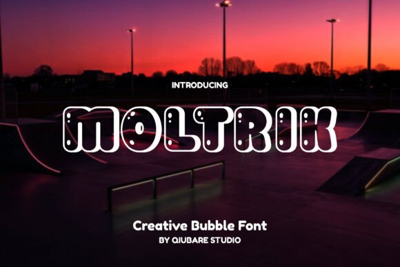
Opening Moltrik for the first time feels like unboxing a well-crafted tool—no fluff, no hesitation. It’s a display font with serious presence: tight letterfit, high contrast between thick and thin strokes, and subtle but deliberate angularity in terminals and joins. The capitals are commanding without being aggressive; lowercase letters (where available) carry restrained energy—not playful, not cold, but deliberately focused. Moltrik doesn’t whisper. It states. Its personality lands somewhere between modern typography and artisanal signage—think boutique coffee branding meets editorial magazine masthead.
Where Moltrik Earns Its Place in Real Projects
In logo design, Moltrik works best when the brand voice is confident, contemporary, and slightly elevated—think skincare lines, independent publishers, or ceramic studios launching premium packaging. I’ve used it as a primary mark for a small-batch candle brand, and it held up beautifully across embossed boxes, matte-label stickers, and Instagram story headers. Its strong rhythm makes it ideal for short phrases: “Hand-Poured,” “Est. 2021,” “Small Batch.” Not for taglines over three words—clarity starts to fray.
For packaging design and product labels, Moltrik shines at medium-to-large sizes on clean substrates: kraft paper, soft-touch laminate, or white matte stock. It resists visual noise. On a recent tea label project, pairing Moltrik with a quiet serif font for ingredients created instant hierarchy and tonal balance—no extra styling needed. In editorial design, it anchors covers and section headers, but never body text. Never.
Social media graphics benefit from Moltrik’s boldness—especially static posts where quick recognition matters. It reads cleanly at 48px in Instagram feed thumbnails and holds weight in Pinterest pins. For digital ads, use it sparingly: headline only, max two lines. I tested it in Google Display Network banners (300×250) and found it legible at 24px—but only with generous letter-spacing and full uppercase. Lowercase variants (when included) need more breathing room and perform better in print than screen.
Merchandise and printable design? Yes—with caveats. On tote bags and enamel pins, Moltrik’s geometry translates crisply. In Cricut projects, its clean vectors cut cleanly, especially at 1.5”+ height. But avoid intricate weeding paths: tight counters (like in ‘e’ or ‘a’) can snag at sub-¾” scale. For Canva templates, Moltrik pairs reliably with system sans serifs like Inter or Montserrat—just lock spacing before exporting.
Where to Pause—and Why
Moltrik is not a workhorse. It’s a spotlight. Use it for brand marks, poster headlines, quote graphics, and premium packaging accents—not for navigation menus, email body copy, or multi-paragraph blog intros. Its strength is singularity, not scalability. Overuse dilutes impact fast. I once saw it applied across an entire Shopify homepage: hero, feature grid, testimonial pull, footer CTA. The result wasn’t bold—it was fatiguing.
Readability drops sharply below 28px in digital contexts and under 14pt in print. Test it in black and white first—some of its nuance lives in contrast, and grayscale renders can mute its intention. Also verify spacing: default tracking often needs tightening for headlines and loosening for all-caps settings. Kerning pairs like “To,” “We,” and “Av” benefit from manual nudge.
How It Shapes Perception—Beyond Aesthetics
Moltrik quietly signals professionalism through precision. Its consistent stroke modulation and balanced proportions suggest intention—not algorithmic trend-chasing. That builds audience trust, especially among discerning buyers (think crafters, designers, boutique shoppers). It doesn’t scream “trendy”; it says “considered.” In brand identity systems, Moltrik strengthens recognition when paired with one neutral supporting typeface—no more than two fonts total. Too many layers compete with its authority.
Engagement lifts when Moltrik is used contextually: a limited-edition drop announcement, a launch campaign banner, a keynote slide title. It performs poorly in low-contrast environments (light gray on white) or busy photo backgrounds. Always test on real mockups—not just desktop previews. A Moltrik headline that pops on your calibrated monitor may vanish on a customer’s phone screen.
Practical Designer Notes You’ll Actually Use
- Test Moltrik in pure black on pure white—and then reverse it. Some display fonts lose definition when inverted; Moltrik holds up, but check tight counters.
- Compare uppercase vs. lowercase usage side-by-side. Its uppercase has more gravitas; lowercase (if included) leans expressive—best for subtle accents, not primary messaging.
- Review spacing in live context: set a sample headline at 48px, export as PNG, zoom to 100% on a mobile device. Does it feel open or cramped?
- Pair it intentionally: beside a warm serif (e.g., Adobe Garamond), a crisp sans serif (e.g., Neue Haas Grotesk), a restrained script font (not flourished), and a grounded handwritten font (for contrast, not harmony). Avoid pairing with other display fonts unless they’re dramatically different in weight and structure.
- Confirm commercial licensing before any client or business use. Moltrik is a premium font—its license covers digital products, merchandise, and SaaS interfaces, but double-check redistribution limits if bundling into Canva templates or Cricut design bundles.
Final Thought: Confidence, Not Convenience
Moltrik isn’t for every project—and that’s its greatest strength. It asks you to be intentional: about message length, placement, contrast, and audience expectation. When used with discipline, it elevates brand identity, sharpens editorial focus, and adds tangible value to packaging design and social media graphics. It won’t solve weak strategy—but in the hands of a thoughtful designer, Moltrik becomes a quiet amplifier: turning clarity into presence, and presence into credibility. Use it like a master tool—not a shortcut.